rOpenSci package or resource used*
What did you do?
As part of the #CottonViz challenge from the Royal Statistical Society, I used {magick} to:
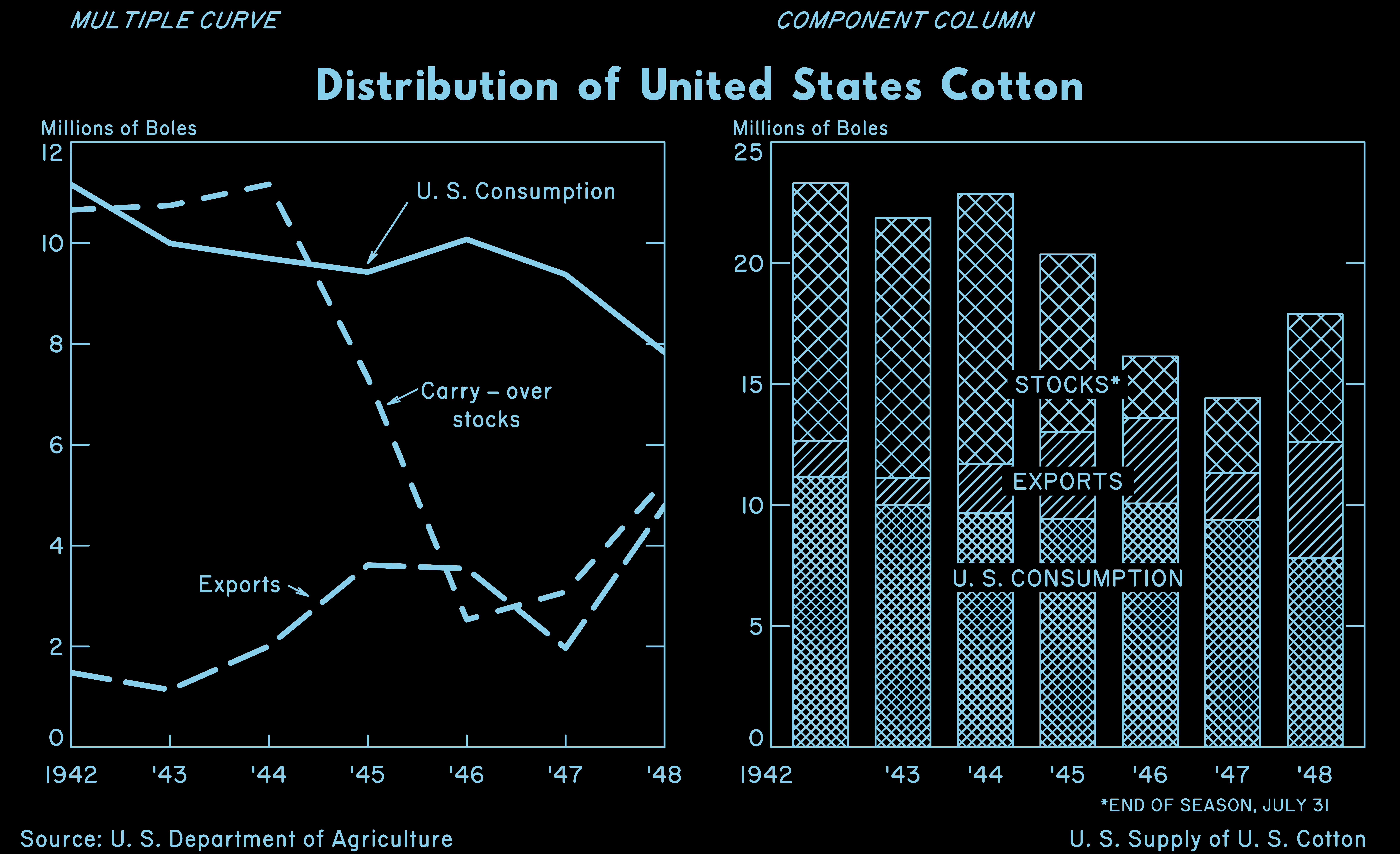
- create a gif that shows incrementally the steps I used to recreate Mary Eleanor Spear’s original data visualisation of US cotton supplies in the 1940s, made with manual methods
- mimic another of Spear’s visualisations that uses ‘colour on the negative’, which she produced manually by ‘coloring negative photostat copies of charts or maps’
Functions used: image_read(), image_scale(), image_animate(), image_negate(), image_transparent(), image_background() and image_write().
URL or code snippet for your use case*
See the:
- blog post about the recreation process
- tweet about the dataviz recreation, with the gif embedded
- tweet about the ‘colour on the negative’ approach
- GitHub repo containing code to reproduce the images
Image
The animation below is a step-by-step animated gif of a recreation of a visualisation of US cotton stocks in the 1940s by Mary Eleanor Spear. First, labelled axes are created for a line plot on the left-hand side, then three labelled lines are added for consumption, stocks and exports of cotton. Hatched columns are then added to a bar plot on the right-hand side, followed by axes and labels. Finally, titles and captions are added and the original image is shown for comparison.

The image below demonstrates the ‘colour on the negative’ approach. It shows two plots of cotton stocks, export and consumption in the USA in the 1940s: a line chart on the left, and a bar chart on the right. It’s an inversion of the Mary Eleanor Spear’s original image, resulting in a black background and with white elements becoming light blue.

Sector
Personal.
Field(s) of application
History of statistics, data visualisation.
Comments
{magick}'s API is very descriptive and easy to use. The intro vignette is easy to follow and gives many examples of its application. Thanks Jeroen!
Twitter handle
@mattdray
@HistoryofStats
@statsyss